ASMR known as Autonomous Sensory Meridian Response is a tingling feeling created by certain sounds that provide relaxation.
My role involves Business Analysis and User Experience design including user research, prototyping and test.
Although there are plentiful ASMR channels on youtube, the number of apps is limited. One of the top ASMR channels on YouTube requested an audio player iOS App that will attract ASMR listeners.
Before starting the UX process, I will analyze the client’s business objectives. Because a good design is;
1. Viable: Design should cover business objectives. Communication with business executives or owners is necessary.
2. Desirable: Design should be human-centric. It can be accomplished with the design thinking process.
3. Feasible: Design should be doable in terms of technology. Developers should be involved during the project. I have a developer background to fulfill it.
Aligning business objectives with user needs is essential. To achieve this, I engaged with client executives in interviews to uncover the company’s business strategy. Below information is gained from the business owner.
I used the below methods of design thinking while creating this app.
It is time to put myself in the user’s shoes.
I did my best to set my assumptions and experiences aside for a better understanding of the users.
In order to understand the user’s needs and pain points, I used Quantitative and Qualitative user research methods.
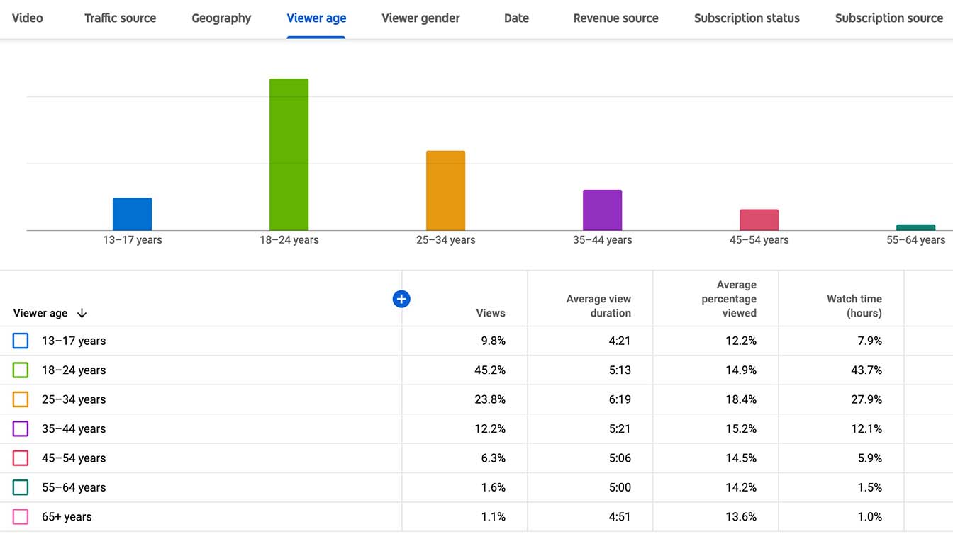
ASMR Relaxation has a channel on YouTube under another name with around 100K subscribers. I collected very useful data from YouTube analytics of this channel such as demographics, geography, and engagement.
I conducted semi-structured interviews with users and channel owners. I aimed to learn;
I organized interview results into groups based on their relationships.
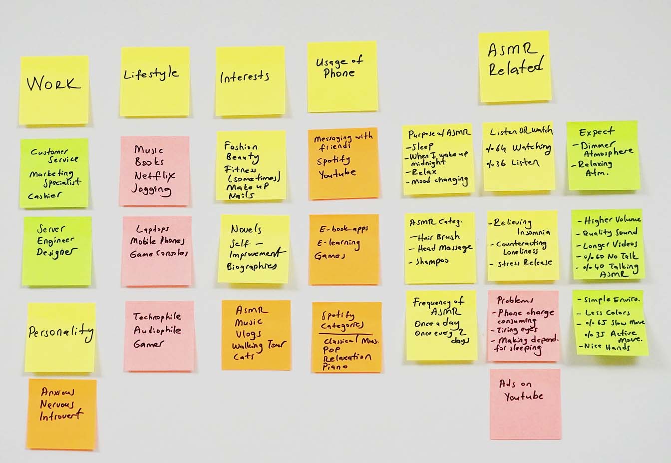
User research was very productive, I gathered useful information from the process.
At the end of this phase, I will define a meaningful and actionable problem statement.
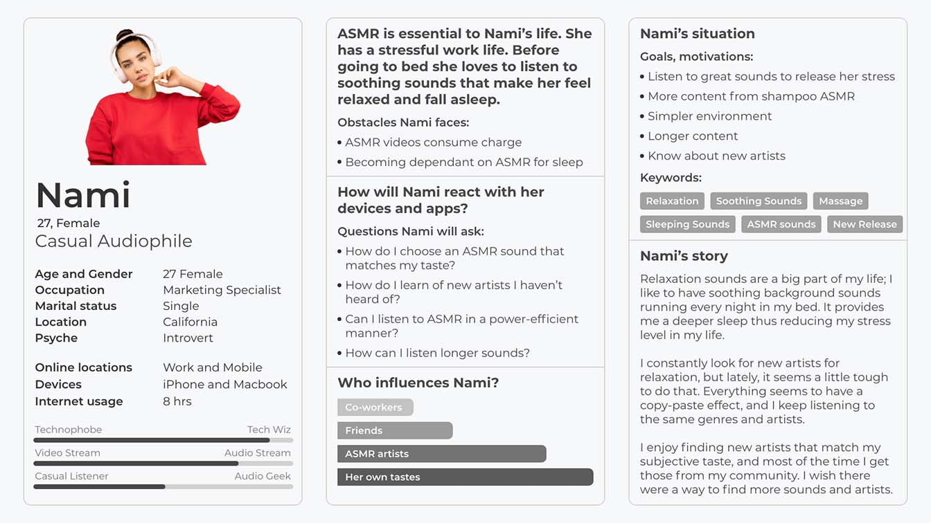
I created a persona from research data to understand user needs and goals.
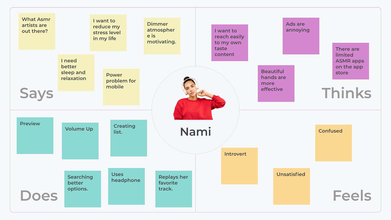
Considering the current state I used the empathy mapping method to visualize research findings.
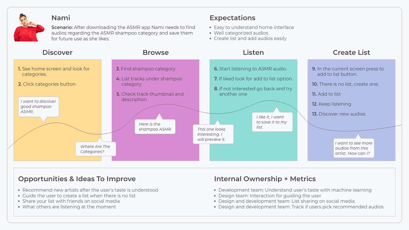
I used a customer journey map to see the relationship between the user and the app over time and across all channels.
With all findings and data, it is time to create a problem statement.
People who relax with ASMR sounds need sound stream apps because they need to customize their ASMR preferences for a better experience.
In order to get ready for the ideation session, I prepared HMW questions.
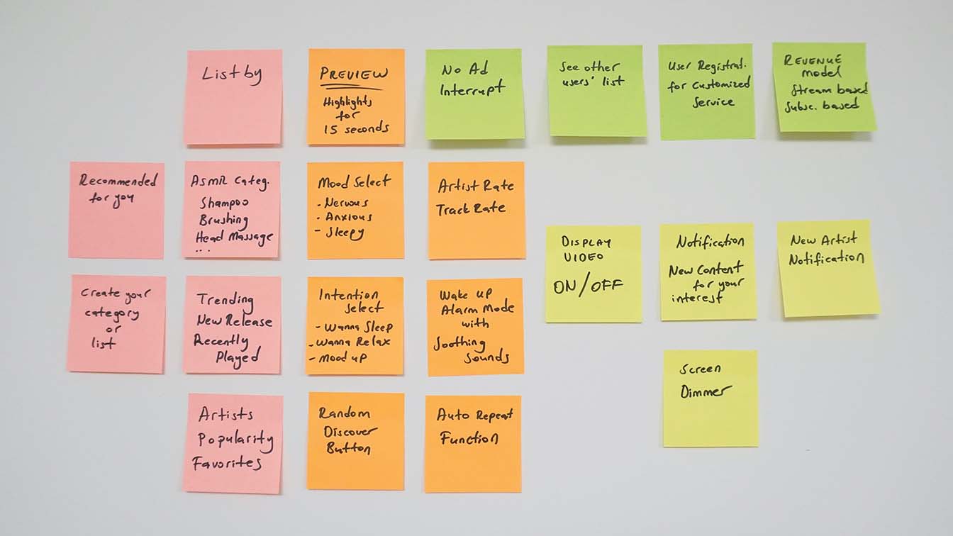
In the ideate phase, I generated as many ideas as I could. Solutions are filtered into the most practical and most effective ones.
As I am the only designer in the team it is braindumping more than brainstorming. I selected the best solutions for the design.
After braindumping, I used the SCAMPER method to be more innovative. It encouraged me to think from different perspectives. Taking YouTube, Spotify, and prospective ASRM app as an existing product. I tried to;
Spotify categorization, filtering options for all kinds of lists.
ASMR artists can upload their content, revenue sharing models like YoutTube. Skip preview features like Netflix.
Different types of subscription models.
Only massage type ASMR content should be uploaded.
As a wake up service. It can also be used to create an atmosphere at hairdressers.
Limited categories, simple functions are essential.
Rearrange the registration process. Let the users play up to 3 audios without registration.
I turned my abstract idea into a tangible design.
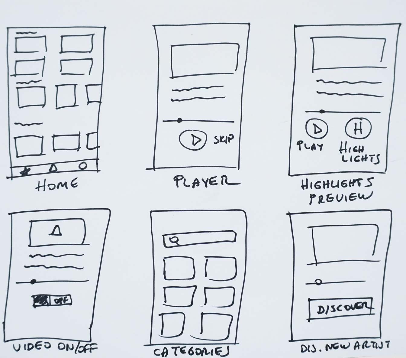
This is a simple prototype after a few ideas were sketched. It helped me to prepare a mid-level mockup at the next step.
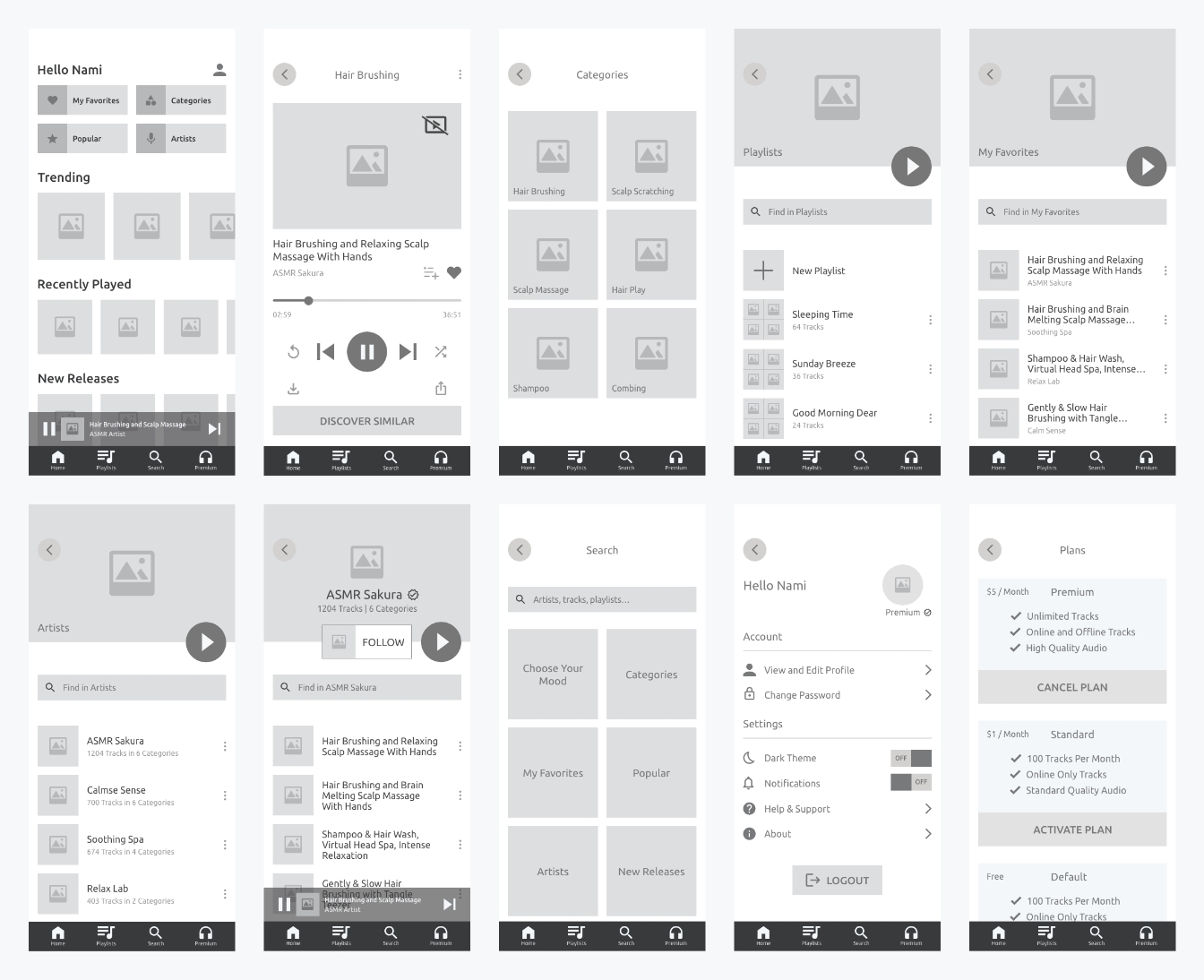
I turned my sketched paper prototypes into lo-fi mockups to understand the design better.
I conducted tests throughout the design thinking process. In this phase, two kinds of evaluation methods are used to find major usability problems with my prototypes.
I got feedback from design experts at DesignX Community and IxDF community. I validated Jakob’s Ten Usability Heuristics from Nielsen Norman Group. I also used IxDF’s Heuristic Evaluation Sheet.
I invited some users to my office to get insightful results. I also conducted some remote tests. I focused on both objective and subjective metrics from 10 participants.
How will I know whether my design is successful or not? How will the business owner be convinced? What will happen next?
I am responsible for Business Analysis and UX Design. That is why I didn't use any colors in my design. From this point, the UI designer will take responsibility. After all development phase will start. Test sessions are planned between all these phases.
After understanding the customer’s business goals, we set KPIs. If these KPIs are fulfilled in the first year then we will consider the design was successful.
KPIs are based on Google’s HEART framework and Return on Investment value.
We aimed for a good enough design for the current phase of the project. After collecting data from real users we will enhance the design by adding or removing features.
Created a User Experience. Next phase is creating User Interface and developing the app.
ROLES
Business Analysis / UX Research / UX/UI Design / Development
Android and Desktop versions will be designed.
ROLES
UX Research / UX Design / Development
Collected data will be analyzed and evaluated. Depending on KPIs we set, new design decisions might be taken.
ROLES
UX Research
Although ASMR users have similar needs, they are not the same people. Different users have different priorities even some have extreme expectations. So I had to trade off some user needs.
There is a conceptual gap between the users and the business owners. Communication with both users and business owners was crucial. It also helped the business owner redefine some business objectives.
Testing is important throughout the project. I did not validate tests frequently so I had to iterate more which was more time-consuming. Next time I will keep this in mind.